UI shell right panel
Color
The UI Shell can be customized to use any of the four IBM themes by applying an inline theme to the shell zone.
| Element | Property | Color token |
|---|---|---|
| Panel | background color |
|
| border-left |
| |
| Header action | border-left, border-right |
|
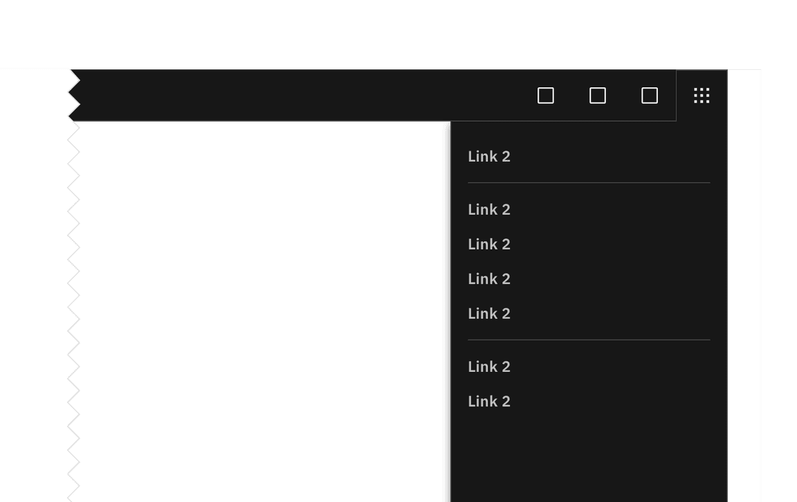
UI shell switcher example
Item
| State | Property | Color token |
|---|---|---|
| Enabled | text color |
|
| Hover | background color |
|
| text color |
| |
| Focus | border |
|
| Active | background color |
|
| text color |
| |
| Selected | background color |
|
| text color |
| |
| Disabled | text color |
|
Typography
| Element | Font-size (px/rem) | Font-weight | Type token |
|---|---|---|---|
| Item | 14 / 0.875 | SemiBold / 600 |
|
Structure
The panel spans the full height of the browser and is fixed to the right edge of the window.
| Element | Property | px/rem | Spacing token |
|---|---|---|---|
| Panel | width | 256 / 16 | – |
| Item | height | 32 / 2 | – |
| padding left, padding right | 16 / 1 |
| |
| Header action | height, width | 48 / 8 | – |
| svg | 20 / 1.25 | – |
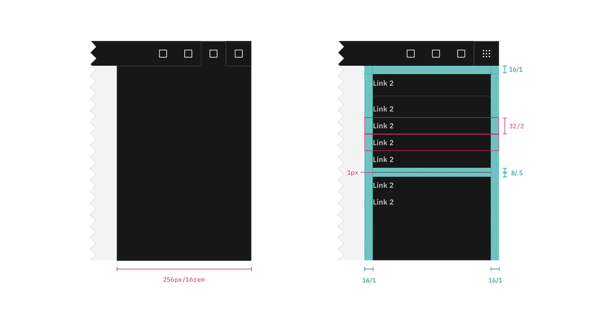
Structure and spacing measurements for right panel | px | rem.