Content switcher
The following page documents visual specifications such as color, typography, structure, and size.
Color
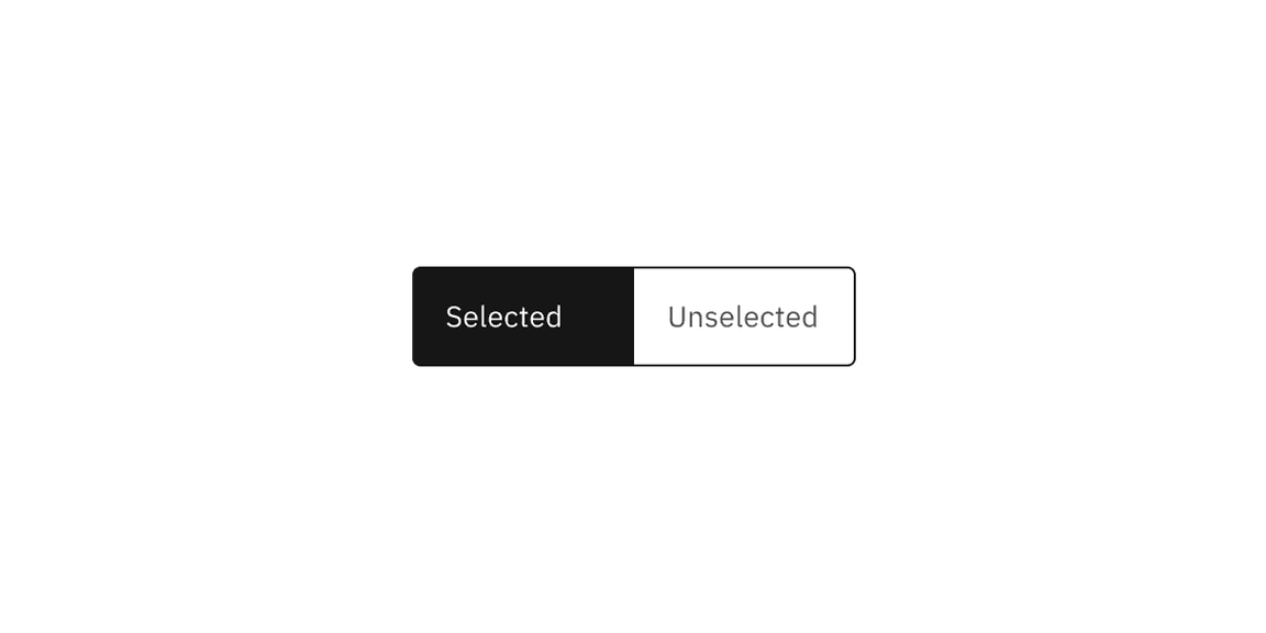
Content switcher includes two default-enabled content states: selected and unselected with the selected state using a high contrast color.
| Type | Element | Property | Color token |
|---|---|---|---|
| Selected | Container | background-color |
|
| Label text | text-color |
| |
| Icon | svg |
| |
| Unselected | Container | background-color | transparent |
| Label text | text-color |
| |
| Icon | svg |
| |
| Border | border |
| |
| Divider | border |
|
- Denotes a contextual color token that will change values based on the layer it is placed on.

Interactive states
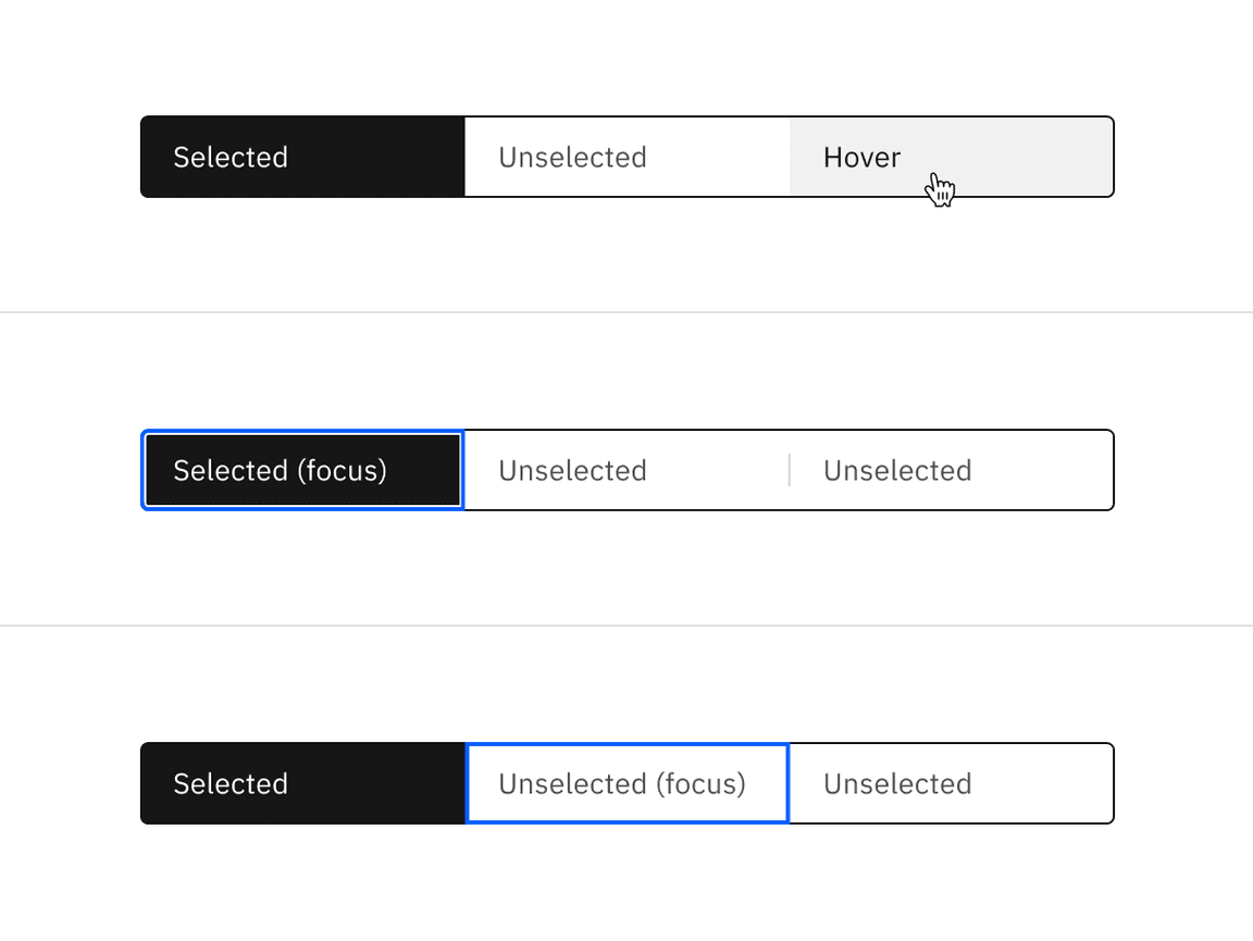
Content switcher has three interactive states—hover, focus, and disabled. Hover states only apply to the unselected state.
| Type | State | Element | Property | Color token |
|---|---|---|---|---|
| Selected | Focus | Container | background-color |
|
| Label text | text-color |
| ||
| Icon | svg |
| ||
| Border | inner-border |
| ||
| Disabled | Container | background-color |
| |
| Label text | text-color |
| ||
| Icon | text-color |
| ||
| Unselected | Hover | Container | background-color |
|
| Label text | text-color |
| ||
| Icon | svg |
| ||
| Border | border |
| ||
| Focus | Container | background-color | transparent | |
| Label text | text-color |
| ||
| Icon | svg |
| ||
| Border | border |
| ||
| Disabled | Container | background-color | transparent | |
| Label text | text-color |
| ||
| Icon | text-color |
| ||
| Border | border |
| ||
| Divider | border |
|
- Denotes a contextual color token that will change values based on the layer it is placed on.

Typography
Content switcher label text should be set in sentence case, with only the first word in a phrase and any proper nouns capitalized. The label text should not exceed three words.
| Element | Font size (px/rem) | Font weight | Type token |
|---|---|---|---|
| Label text | 14 / 0.875 | Regular / 400 |
|
Structure
Content switchers must have at least two options for the user to choose from. Each container that makes up the content switcher is equal in size.
| Element | Property | px / rem | Spacing token |
|---|---|---|---|
| Container | corner radius | 4px | – |
| Label text | padding-left, padding-right | 16 / 1 |
|
| Icon (sm) | padding-left, padding-right | 8 / 0.5 |
|
| Icon (md) | padding-left, padding-right | 12 / 0.75 |
|
| Icon (lg) | padding-left, padding-right | 14 / 0.875 | – |
| Divider | border | 1px | – |
Default structure
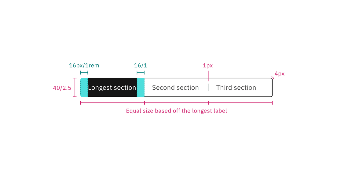
The width of a text container is determined by the length of the longest label text within its content switcher.

Structure and spacing measurements for the text content switcher | px / rem
Icon-only structure
The width of an icon container is determined by the fixed size within its content switcher.
Structure and spacing measurements for the icon content switcher | px / rem
Size
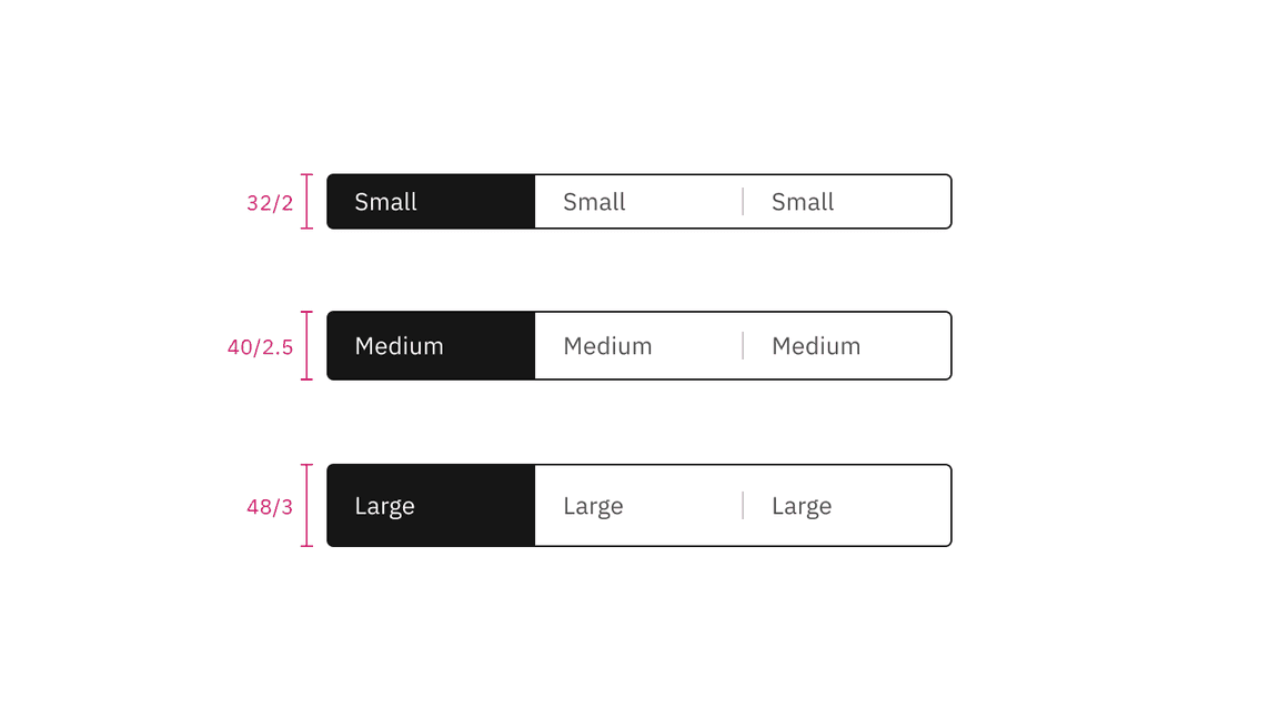
There are three content switcher sizes—small (32px), medium (40px), and large (48px).
| Element | Size | Height (px / rem) |
|---|---|---|
| Container | Small (sm) | 32 / 2 |
| Medium (md) | 40 / 2.5 | |
| Large (lg) | 48 / 3 | |
| Icon | Small (sm) | 16 / 1 |
| Medium (md) | 16 / 1 | |
| Large (lg) | 20 / 1.25 |

Text only content switcher sizes | px / rem
Icon only content switcher sizes | px / rem
Feedback
Help us improve this component by providing feedback, asking questions, and leaving any other comments on GitHub.