Structured list
Structured lists group content that is similar or related, such as terms and definitions.
Live demo
This live demo contains only a preview of functionality and styles available for this component. View the full demo on Storybook for additional information such as its version, controls, and API documentation.
Accessibility testing statusFor every latest release, Carbon runs tests on all components to meet the accessibility requirements. These different statuses report the work that Carbon has done in the back end. These tests appear only when the components are stable.
For every latest release, Carbon runs tests on all components to meet the accessibility requirements. These different statuses report the work that Carbon has done in the back end. These tests appear only when the components are stable.
Overview
Structured list displays a simple list with a considerable amount of items of read-only values. It helps organize and present grouped information into logical and scannable patterns. The content within a list can be stacked to create hierarchy within the data.
When to use
- To browse information or select certain information within the group in the simplest form
- To view description and detailed information, present features, or compare pricing plans
When not to use
Nesting items is not recommended, as structured lists are used to present simple data. If you have more than 25 items or additional content that needs to be shown, consider using a data table, which supports nesting items and presents a larger set of content.
Variants
| Variant | Purpose |
|---|---|
| Default | Allows the user to quickly browse and view information within a group of data |
| Selectable | Allows the user to mark or select a desired option within a group of data |
Formatting
Anatomy
Structured list is composed of two sections—column header and data row.
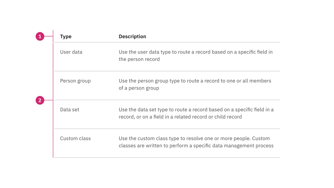
- Column header: Shows titles for the row header description.
- Data row: Shows different types of data. Rows can be selectable and modified to show alternating zebra stripe background colors
Sizing
The structured list is available in two different sizes in height: default and condensed. The structure list’s width varies based on content and layout.
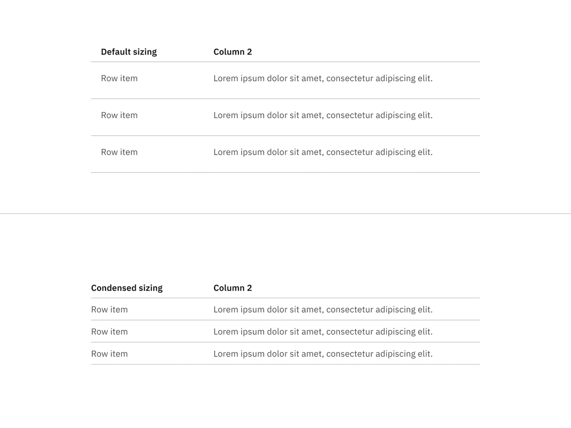
Default and condensed sizes for structured lists
Alignment
The structured list is available in two alignment styles: hang and flush alignment. We do not offer the flush alignment with selectable functionality.
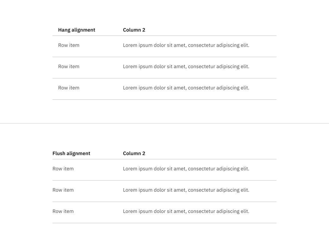
Hang and flush alignment for structured lists
Content
- A maximum of three paragraphs of text is recommended per row.
- A structured list’s title and row information should use sentence-case capitalization.
Column header titles
- Column header titles should be short and clear, sticking to one or two words that describe the data in that column.
- In cases where a column header title is too long, wrap the text to two lines and then truncate the rest of the text. The full text should be shown in a tooltip on hover.
- Column header titles should use sentence-case capitalization.
States
The default structured list variant is read-only and does not have any interactive states other than enabled. The selectable structured list variant has the following states: enabled, hover, focus, selected, disabled, and skeleton. For detailed visual information about the various states for this component, refer to the style tab.
| State | When to use |
|---|---|
| Enabled | When an action in the list is live but a user is not directly interacting with it. This is commonly referred to as the default or normal state of the component. |
| Hover | When a user’s mouse cursor is hovering over the structured list row. |
| Focus | When a user tabs or clicks on a row, it becomes focused, indicating the user has successfully navigated to the component (except default structured list). |
| Selected | When a user presses space or clicks on a structured list row to select it. |
| Disabled | When the user is not allowed to interact with a selectable structured list due to either permissions, dependencies, or pre-requisites. |
| Skeleton | Use on an initial page load to indicate that the structured list has not yet fully loaded. |
Interactions
Selectable structured list
- Only one item can be selected from the list.
- By default, no option should be selected.
- If you need to select multiple items, use a data table.
- When the user selects an item from the list, the selected row will appear with
the icon.radio-button--checked
Default
Default structured lists are used to display information to the user, such as pricing plans. These structured lists can have internal calls-to-action (CTAs), such as a button or a link.
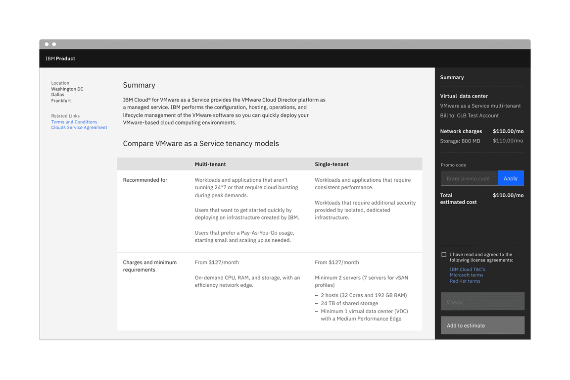
Default structured list
Selectable
Selectable structured lists work well for presenting options to a user in a structured manner, such as a set of pricing plans. Selectable tiles may contain internal CTAs (like links to docs) if the internal CTA is given its own click target. Selectable structured lists have a single-select state working like a radio button.
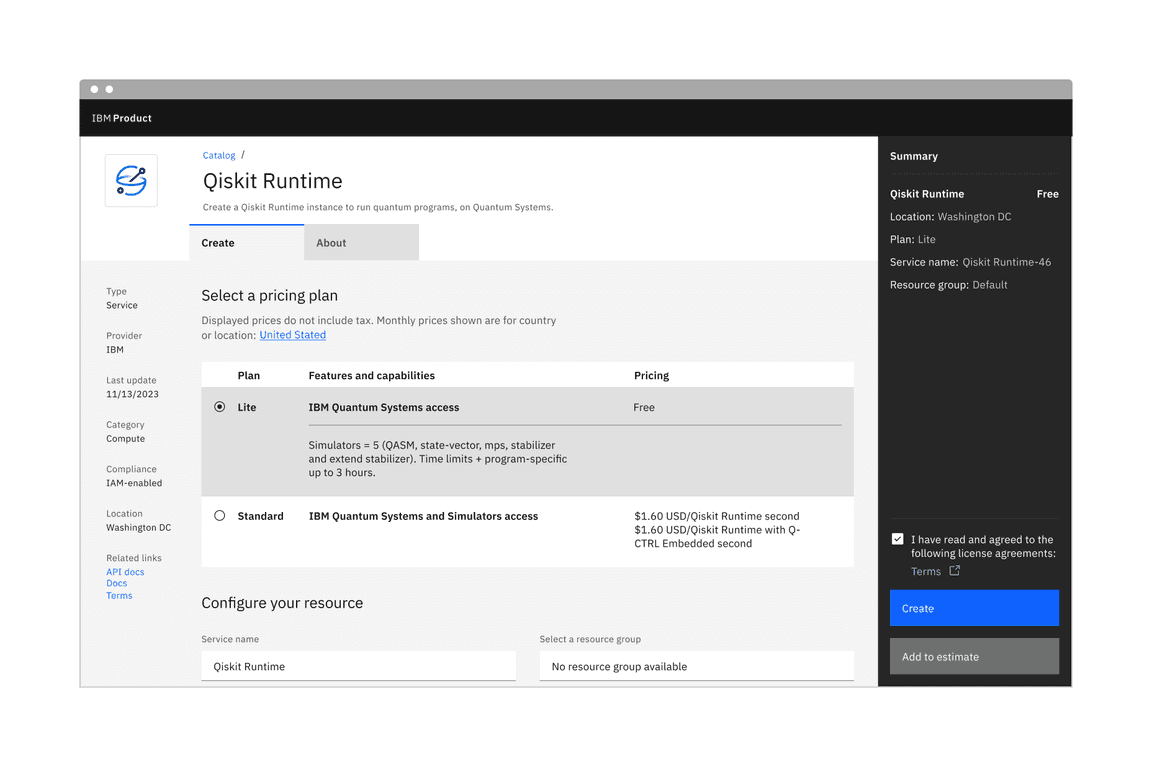
Selectable structured list
Modifiers
Background
A background has been added to the structured list, and it is optional. The background is only available for the hang alignment structured list, in default and selectable variants. It is not available for the flush alignment structured list.
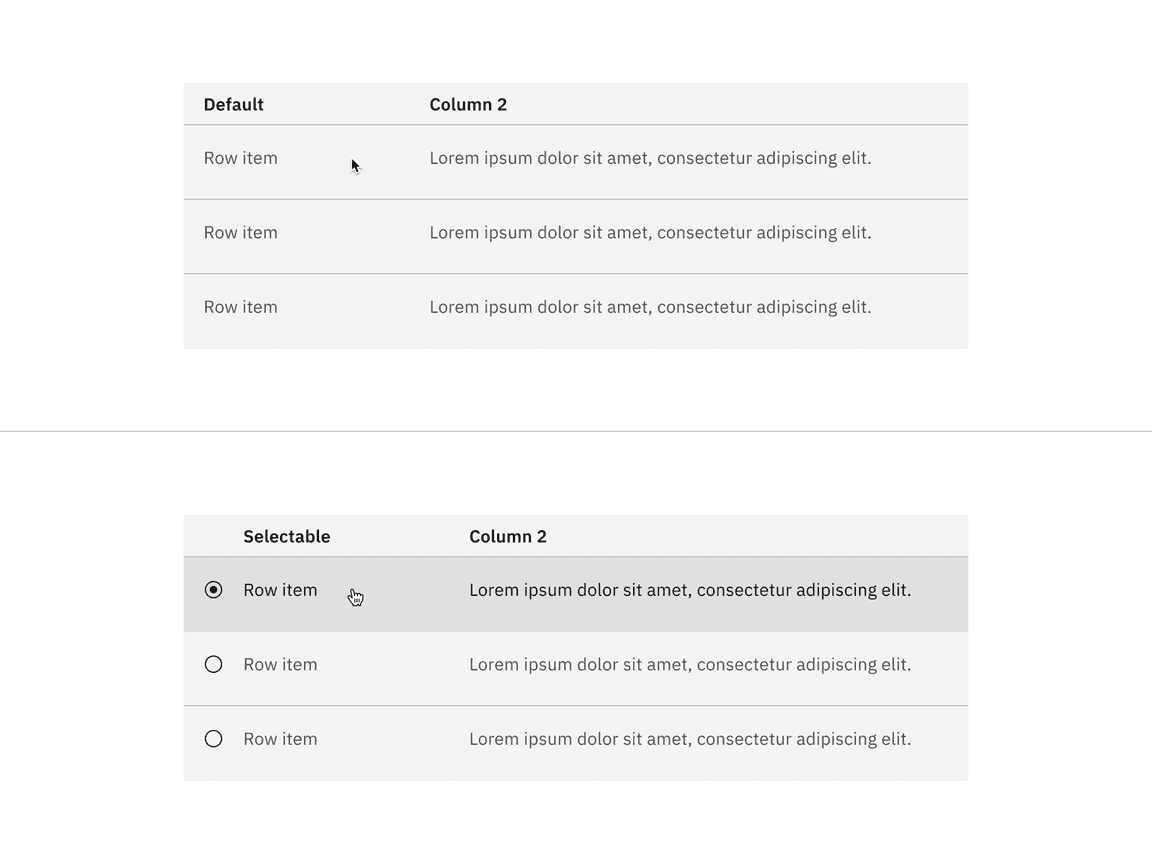
Default and selectable structured list with background
Related
These following components are additional ways to organize a group of data.
Feedback
Help us improve this component by providing feedback, asking questions, and leaving any other comments on GitHub.